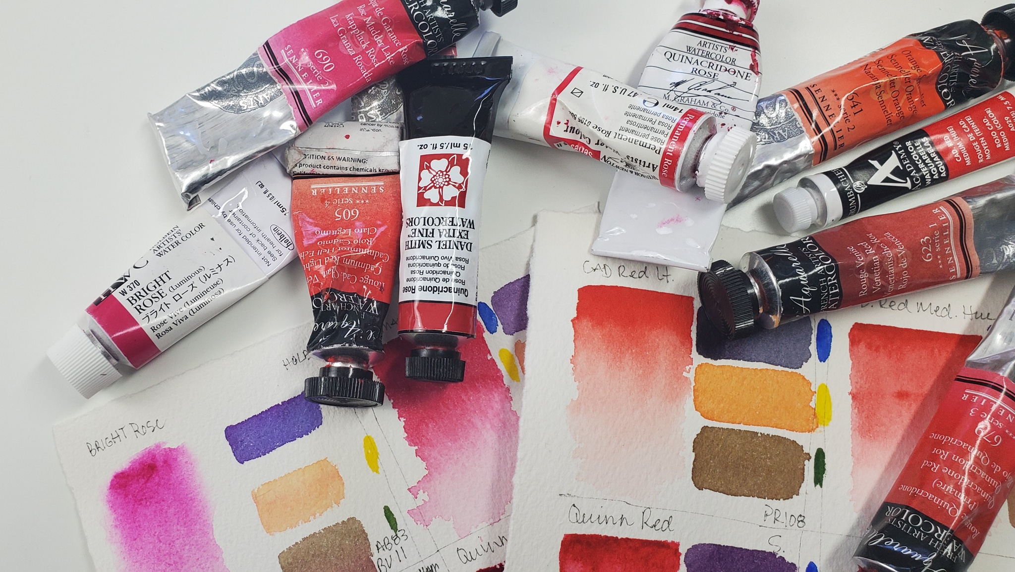
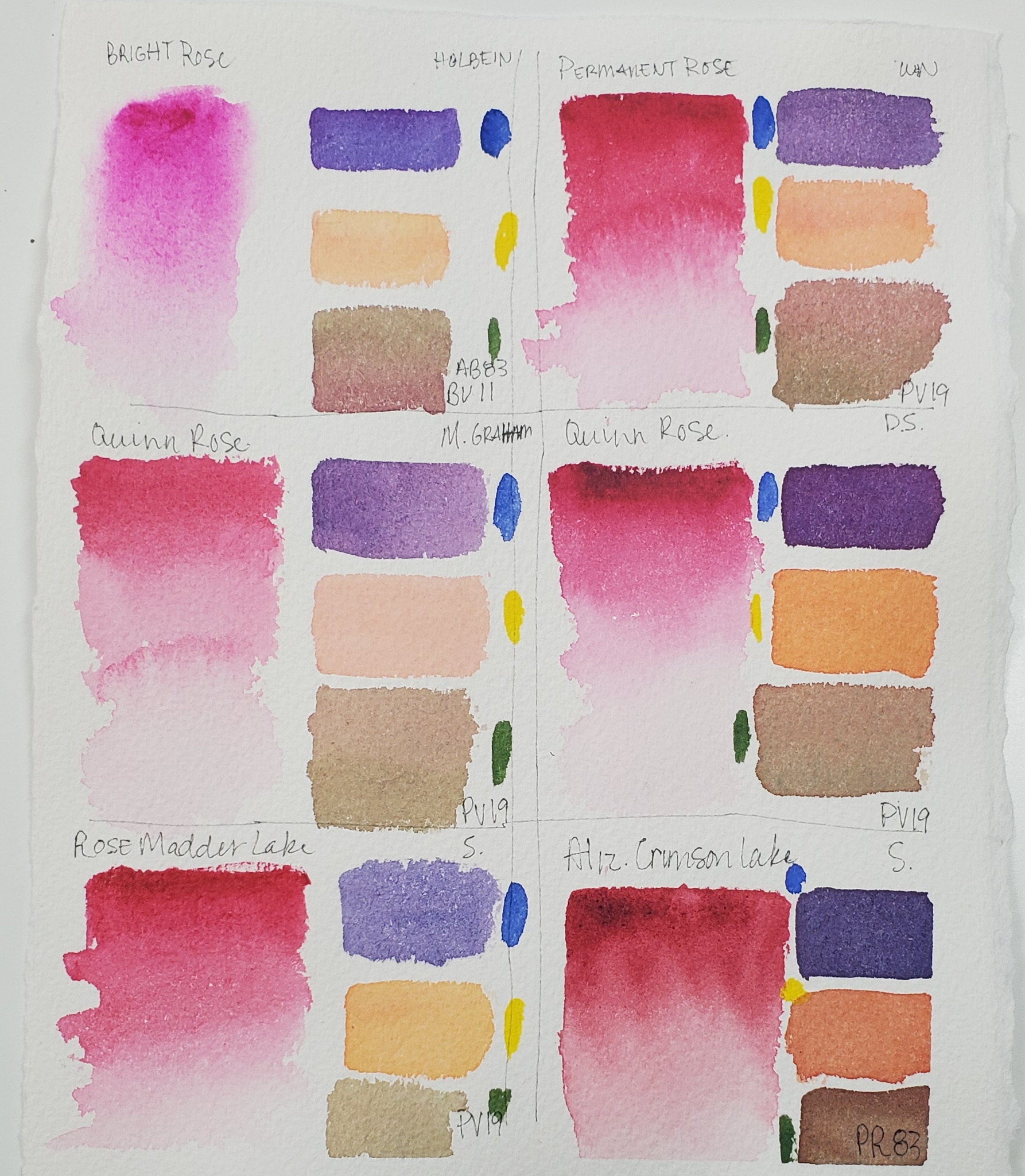
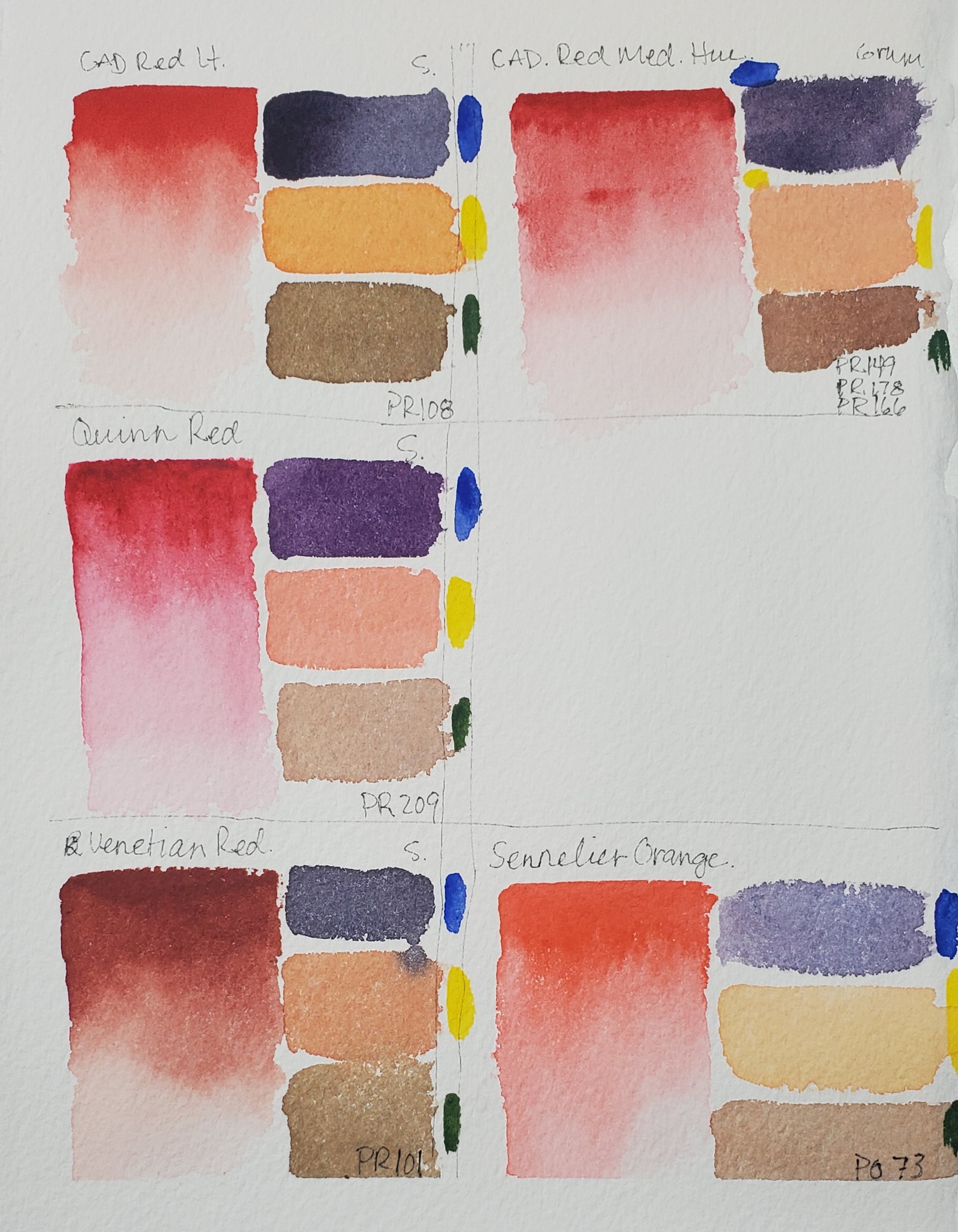
With so many choices of Reds it can be hard to decide which ones to choose for your palette. Do I pick two, five, or do I only need one? In this video I will show you a wide variety of reds and mix them with primary colors Blue and Yellow and with its compliment green. This way you can see what each color looks like and what it is capable of doing for your palette.
Check out the video here.

DISCLAIMER: This page contains affiliate links, which means that if you click on one of the product links, and purchase it through Amazon I’ll get a small commission! These small commission help to keep me making more art and more videos! I’m super grateful for your support!
Supplies:
Bright Rose https://amzn.to/2Wv6zzy
Permanent Rose https://amzn.to/2Wz5CWL
Quinacridone Rose M. Graham https://amzn.to/2QA7XwU
Quinacridone Rose Daniel Smith https://amzn.to/3bcgqhN
Rose Madder Lake https://amzn.to/3bfBZhm
Alizarin Crimson Lake https://amzn.to/3bl1XAl
Cad Red Light Sennelier https://amzn.to/2xUQHfn
Cad Red Med (Hue) Grumbacher https://amzn.to/2QBhW54
Quinacridone Red https://amzn.to/3b79fYe
Venetian Red https://amzn.to/2xSi6yt
Sennelier Orange https://amzn.to/2y0bRZP
Cad yellow Light https://amzn.to/2WygXq8
Ultramarine Blue https://amzn.to/2QaKt1e
Sap Green https://amzn.to/2xA3qnz


